This post is simply a personal investment journal based on my own market observations. Please do not take it as investment advice or follow it blindly. Every investment decision is your own responsibility, so please invest carefully and I sincerely hope your decisions lead to successful outcomes.
[Bitcoin, BTCUSDT.P]
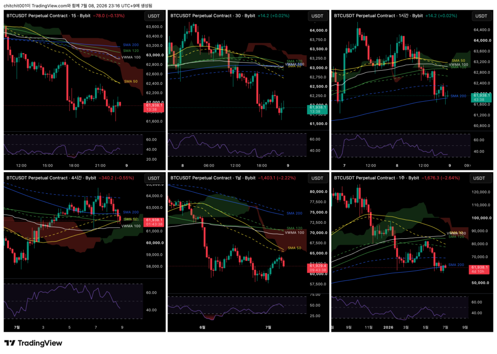
This is the comprehensive Bitcoin chart. From the upper left in a Z-shaped order, the timeframes are the 15-minute, 30-minute, 1-hour, 4-hour, daily, and weekly charts.
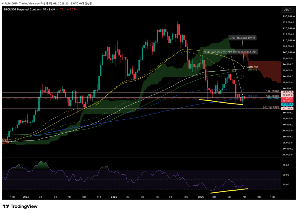
[Weekly Chart]
- The SMA 50 is turning down sharply and appears to be preparing for a dead cross.
- It also looks like price may touch the center of the volume zone from the decline that began in May. From a longer-term perspective, I think it is better to prepare for downside risk. If entering near the volume zone, I would keep the stop-loss tight.
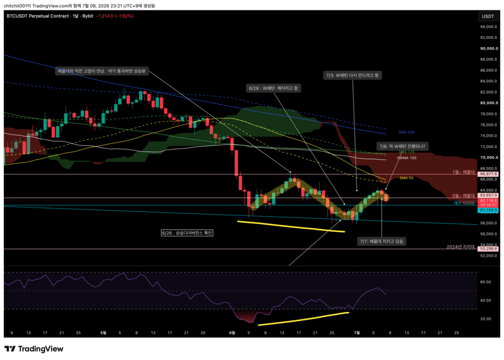
[Daily Chart]
- After briefly forming a W pattern, Bitcoin now seems to be trying to form an inverse W structure.
- Since the moving averages have already formed a dead cross, I think it makes sense to prioritize the downside for now.
- It is a difficult market. Price keeps moving sideways within a certain range.
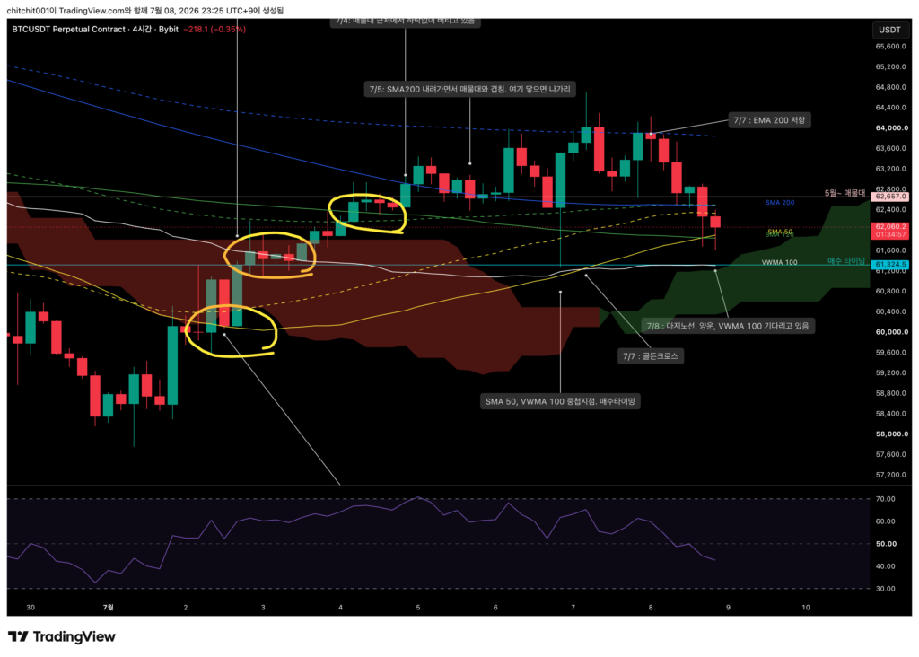
[4-Hour Chart]
- Let’s move to a shorter timeframe.
- First, there is a bullish cloud ahead, and the moving averages are forming a golden cross.
- Interesting, isn’t it? The long-term timeframe points downward, while the mid-term timeframe is showing an upward pattern.
- My interpretation is that an upside setup can be considered on the shorter timeframe, but if it does not work, it needs to be cut quickly.
- If the shorter timeframe turns upward, the longer timeframe could naturally begin to turn upward as well. On the other hand, if the shorter timeframe fails to gain strength, the downward pressure from the longer timeframe could push price sharply lower.
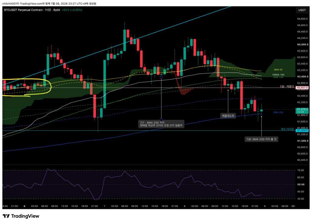
[1-Hour Chart]
- This timeframe also has a bullish cloud ahead, but the moving averages do not look particularly strong.
- Price is forming a long lower wick around the SMA 200. We need to see whether the trend can turn upward from here.
[Ethereum, ETHUSDT.P]
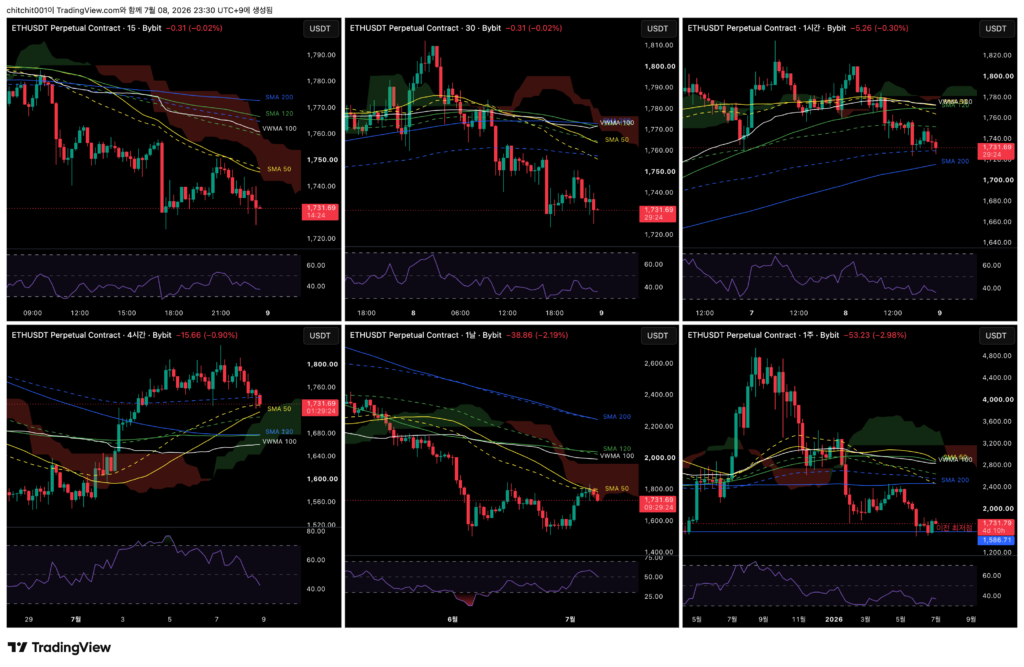
This is the comprehensive Ethereum chart.
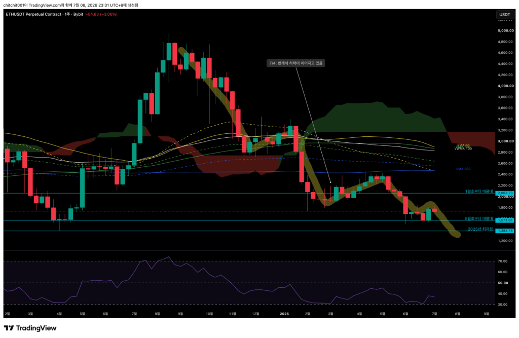
[Weekly Chart]
- Could another step-like decline be starting? After one large rebound last week, Ethereum is showing weakness again.
- If price falls toward the center of the volume zone from the decline that began in early May, there is a high chance that another battle between buyers and sellers will take place.
- The moving averages are also converging. However, the gap between the moving averages and the candles is quite large, so this may be different from previous patterns.
- In the past, when candles were located near an area where the moving averages were converging, price often made a strong move in one direction. This time, it looks a bit different.
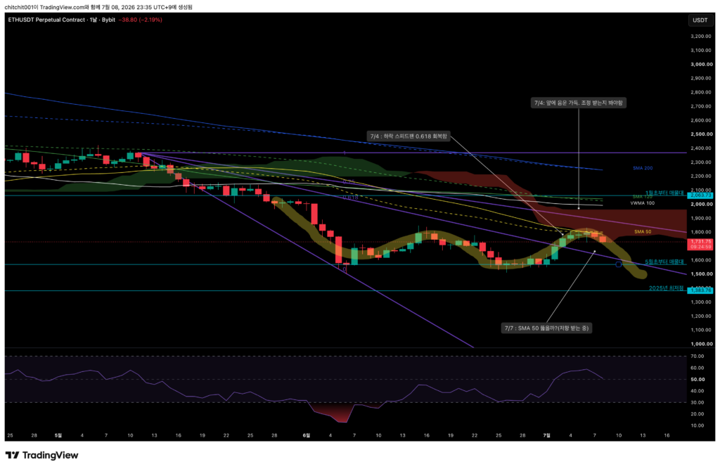
[Daily Chart]
- Price is being blocked right at a thick bearish cloud.
- The SMA 50 is also acting as resistance.
- It does not look like an easy situation for price to move higher.
[4-Hour Chart]
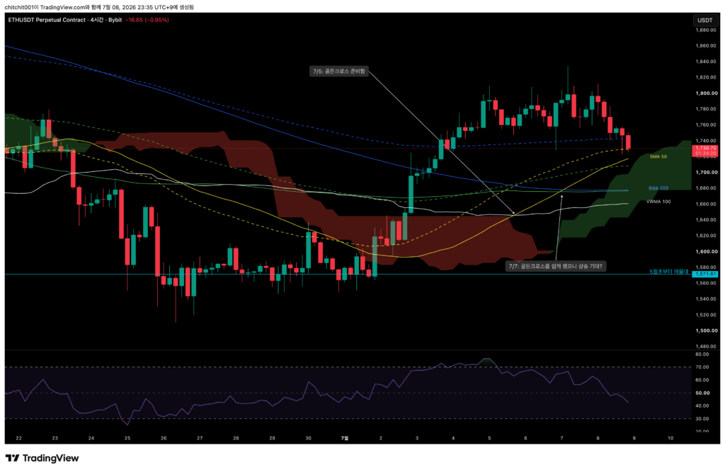
- The candles, which had moved far away from the moving averages, are now getting closer again.
- Since the SMA 50 is rising sharply and approaching price, it may act as short-term support.
- A short-term entry could be considered, but a stop-loss must be planned. The longer-term timeframe is still pointing downward.
[1-Hour Chart]
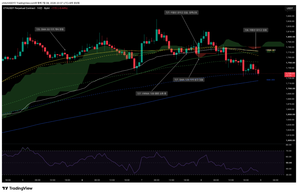
- The moving averages are converging. This is similar to what we see on the longer timeframe, and the gap between the candles and the moving averages is still large.
- In both the long-term and short-term timeframes, Ethereum’s moving averages are coming together. So I think we need to watch closely today and tomorrow to see whether a meaningful direction emerges.