This post is a personal investment journal based on my own market study and observations. It is not financial advice or a recommendation to buy or sell any asset. All investment decisions and responsibilities belong to each individual investor, so please make careful decisions based on your own judgment and risk tolerance.
[Bitcoin, BTCUSDT.P]
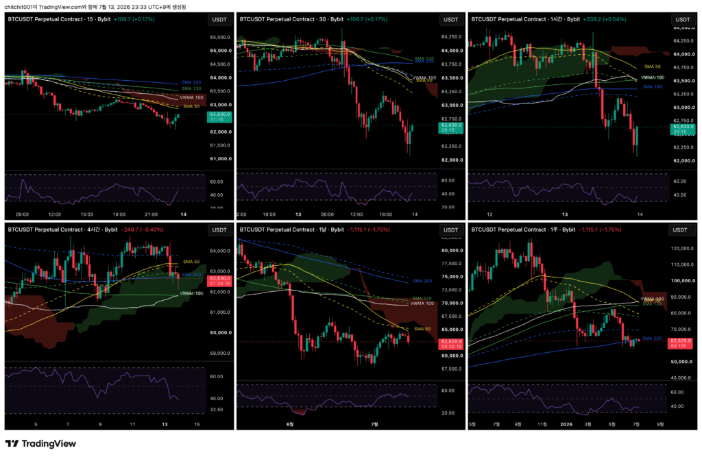
This is the comprehensive Bitcoin chart. From the upper left in a Z-shaped order, the timeframes are the 15-minute, 30-minute, 1-hour, 4-hour, daily, and weekly charts.

[Weekly Chart]
- Last week closed with a doji candle, also known as a cross-shaped candle.
- This week’s weekly candle is starting with a sharp drop. Could the market be turning downward again?
- Price has been moving sideways around the weekly SMA 200 for quite a long time, already seven weeks. A long consolidation at the last line of defense often tends to break downward, so I need to watch how this week’s candle forms.
[Daily Chart]
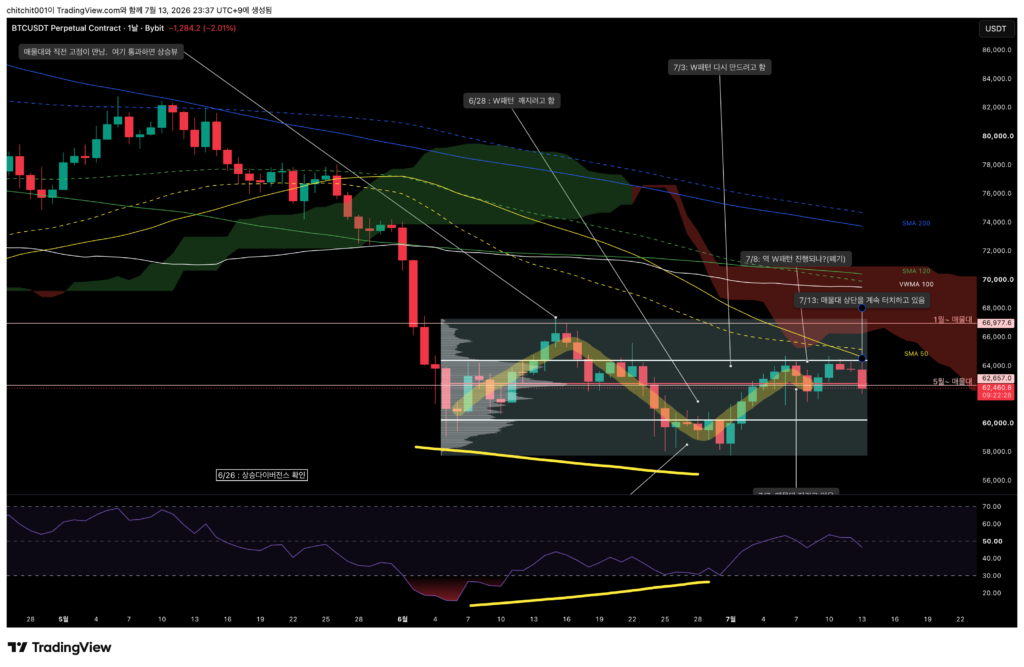
- I marked the volume zone from the sideways range that began in June.
- The thick white line above represents the upper 70% area of that volume zone, and price is still subtly failing to break away from it while facing resistance.
- Meanwhile, the lower line is the centerline of the volume zone that began in May, and price has not broken below that either.
- Bitcoin continues to move sideways in the short range between $62,657 and $64,392. As mentioned before, because this is a bearish market, sideways movement can be interpreted as having a higher chance of leading to downside.
[4-Hour Chart]
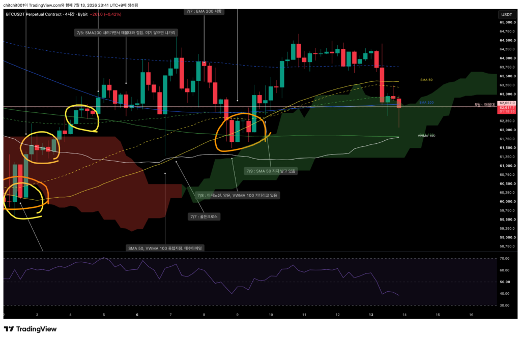
- The candle that broke cleanly above the bearish cloud is now trying to come back into the bullish cloud. This suggests that the upward momentum is not very strong.
- Still, since it is a bullish cloud, the current candle is forming a long lower wick.
- If I wanted to consider buying, I would at least wait until price breaks above the center of the volume zone that began in May.
[1-Hour Chart]
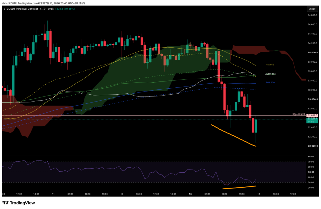
- A bullish divergence seems to be forming. While the longer timeframes still lean bearish, the shorter timeframe appears to be trying to turn upward.
- However, there are not enough candles yet, so it is still too early to judge. I need to watch the 1-hour candles a bit longer and see whether the bullish divergence is confirmed.
[Ethereum, ETHUSDT.P]
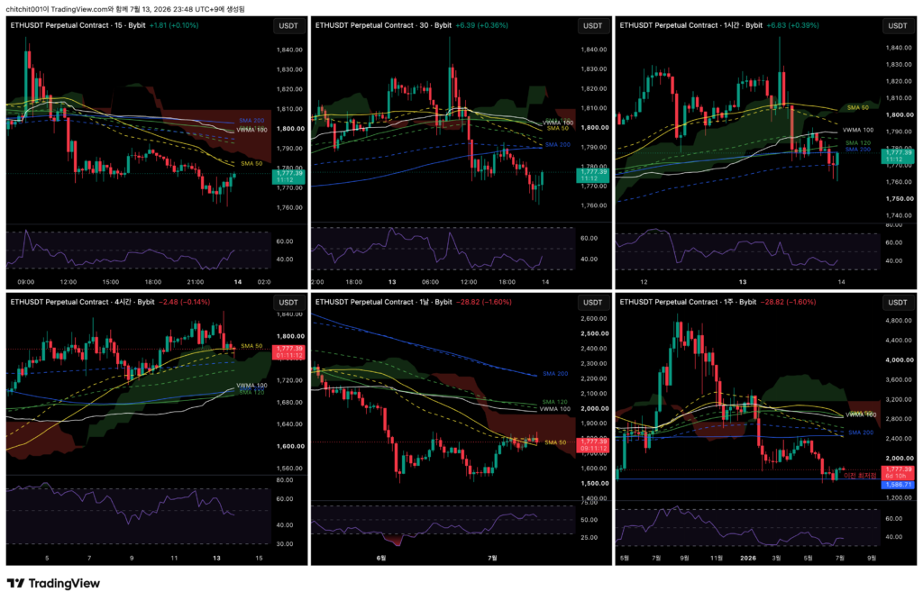
This is the comprehensive Ethereum chart.
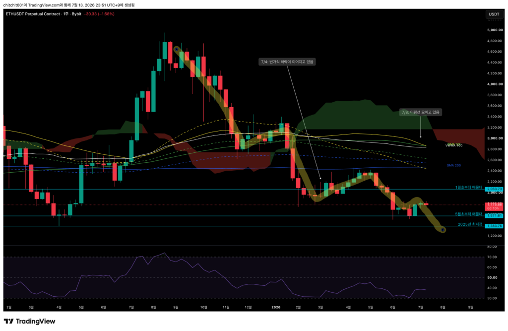
[Weekly Chart]
- At the moment, Ethereum is far away from the moving averages, and the volume zone is also in an ambiguous position.
- I would say this is not really interpretable right now.
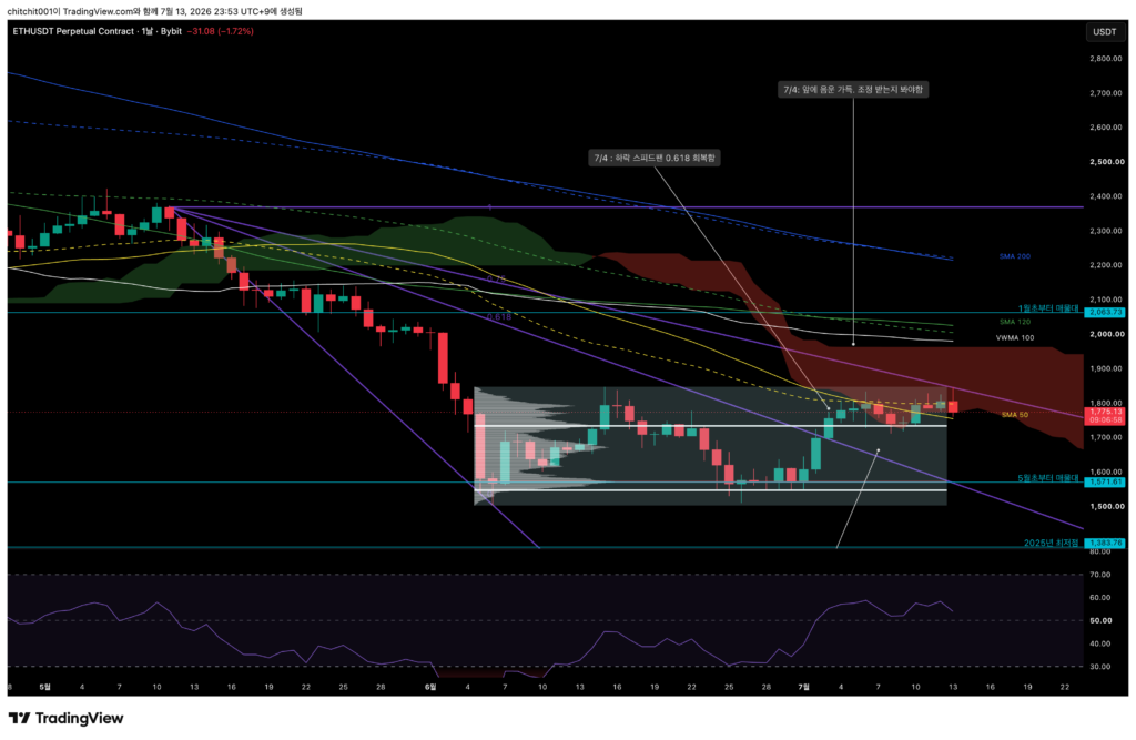
[Daily Chart]
- I marked the volume zone from the sideways range, and Ethereum has already moved above the upper white line, which represents the upper 70% level.
- From here, there is a possibility that price may move toward a new volume zone and price area above.
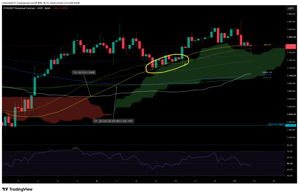
[4-Hour Chart]
- Ethereum had been receiving support from the SMA 50, but it broke below it on the previous candle.
- However, it received support well and moved back into the SMA 50 area.
- The previous candles also received support from the SMA 50, but the situation is a little different now.
- The earlier support happened while the SMA 50 was rising. Now, the SMA 50 is moving sideways. Support during a sideways phase has a greater risk of breaking downward, so I need to keep that in mind.

[1-Hour Chart]
- Ethereum is receiving support from the EMA 200 and facing resistance at the SMA 120.
- It would be good to see price move sideways in this range, build up energy, and then decide on a direction. For now, I need to watch the candles a little longer.