This post is simply a personal investment journal based on my own market observations. Please do not take it as investment advice or follow it blindly. Every investment decision is your own responsibility, so please invest carefully and I sincerely hope your decisions lead to successful outcomes.
[Bitcoin, BTCUSDT.P]
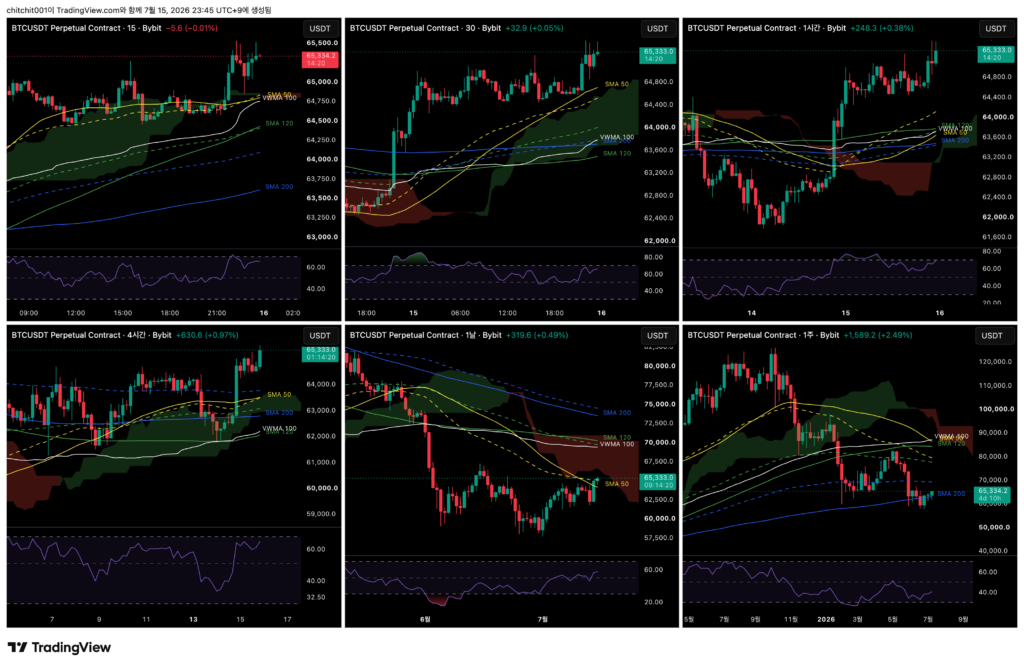
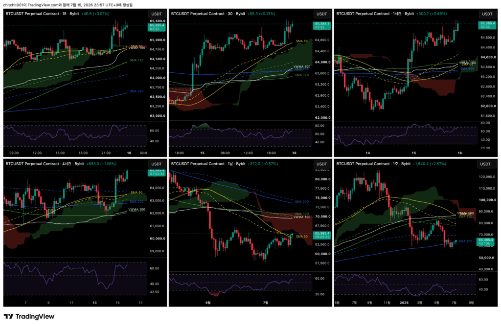
This is the comprehensive Bitcoin chart. From the upper left in a Z-shaped order, the timeframes are the 15-minute, 30-minute, 1-hour, 4-hour, daily, and weekly charts.
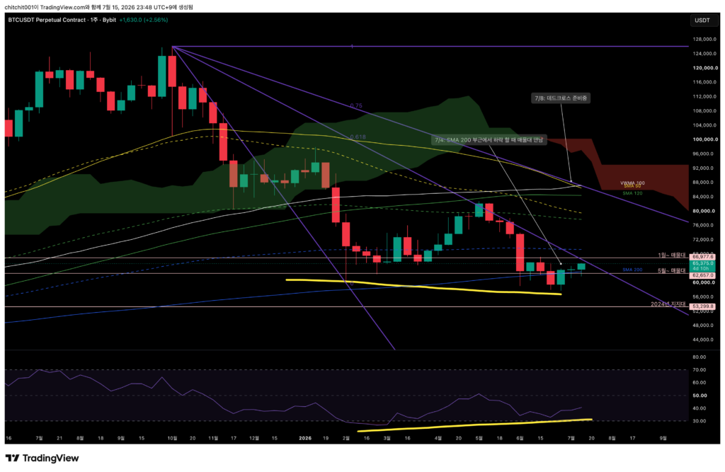
[Weekly Chart]
- Look at the purple speed fan. Price is getting close to the 0.618 area.
- Bitcoin previously faced resistance here and moved lower. If it touches this line again, I need to keep resistance in mind. If it breaks through this area, then I also need to consider the possibility of a move toward the 0.75 level above.
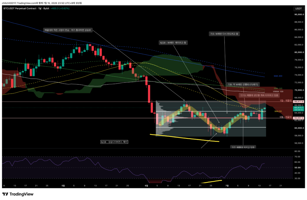
[Daily Chart]
- Bitcoin has broken above the upper 70% area of the sideways volume zone. If today’s daily candle closes above this level, I may need to consider the possibility of a larger move higher. Since price has broken through the existing volume zone, I should think of it as starting to form a new one.

[4-Hour Chart]
- Look at the yellow circles. Price is moving up while receiving precise support from the moving averages. This is an area where the moving averages can be trusted.
- However, the current market is quite overheated. The RSI is approaching 70.
- With the idea that the longer-term trend may be trying to turn upward, I think it would be better to look for entries when pullbacks appear on shorter timeframes.
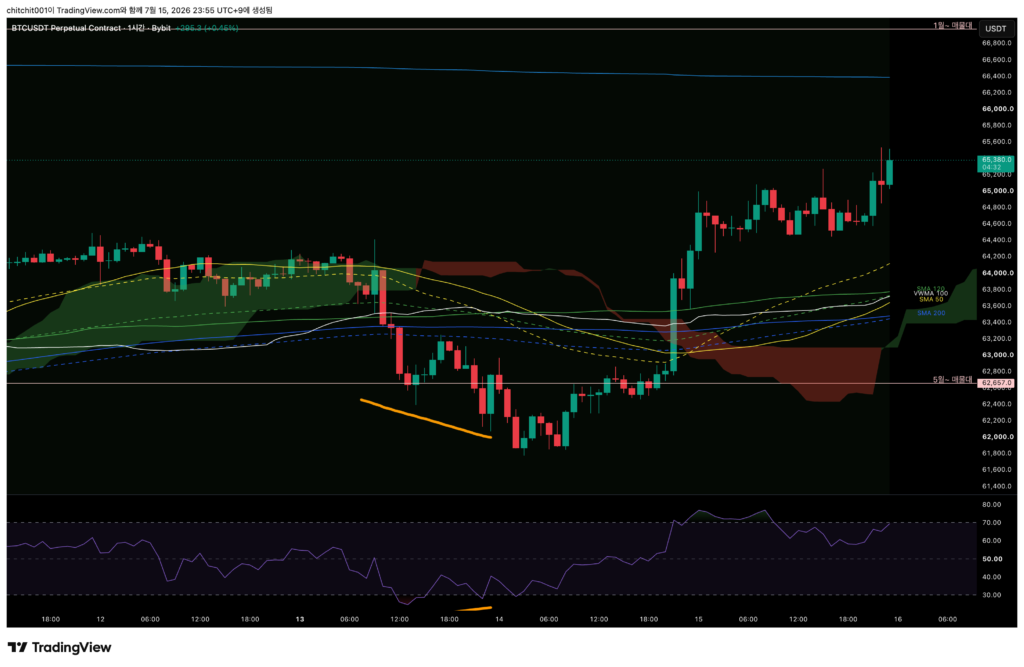
[1-Hour Chart]
- Price has moved far away from the moving averages. This is an area that is difficult to interpret.
- In this kind of situation, it is better to wait until the candles and moving averages come closer together again.
Bitcoin appears to be trying to begin a longer-term uptrend, so a reasonable strategy may be to watch the shorter timeframes and look for entries when pullbacks appear.
[Ethereum, ETHUSDT.P]
This is the comprehensive Ethereum chart.
[Weekly Chart]
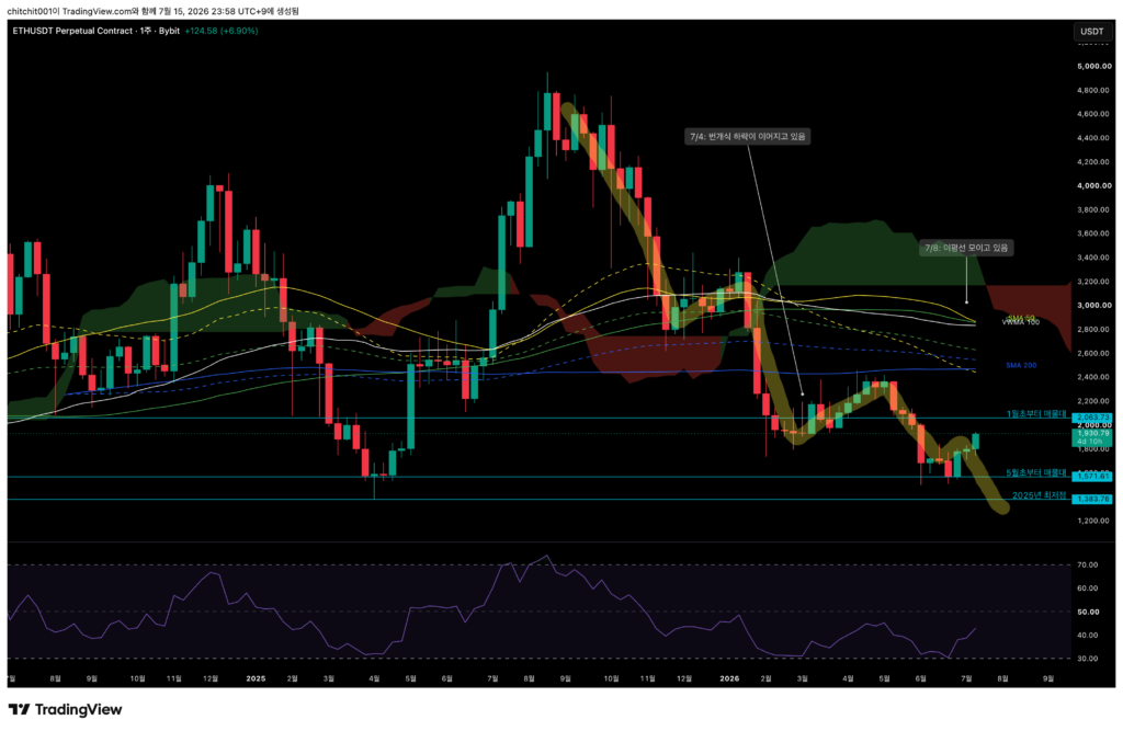
- Ethereum is showing an even stronger move higher. Since it has now posted three consecutive bullish weekly candles, the overall flow itself looks good.

[Daily Chart]
- Ethereum has moved far above the upper 70% area of the sideways volume zone and is now trading in a completely different area.
- It has also broken above the 0.75 area of the purple downward speed fan. From here, it looks like it may be preparing to move into another new range.
[4-Hour Chart]
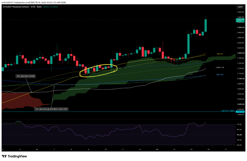
- The gap between the candles and the moving averages is quite wide. A short-term pullback could happen, and that may need to be viewed as an opportunity.
- This is a time when I need to control the desire to buy immediately.

[1-Hour Chart]
- Ethereum is also moving in a completely different area. I need to wait for a short-term pullback.